

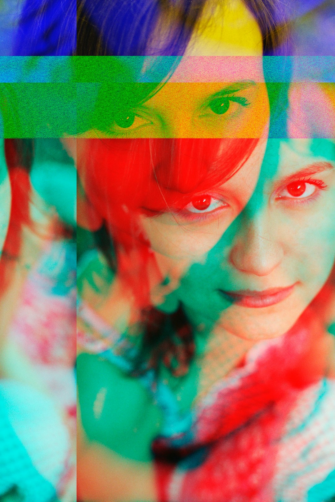
A duotone effect replaces all the tones in a photo with just two colors, one for the shadows and one for the highlights, giving an image a bold, stylized, on-brand look. It’s a popular technique for social posts, event flyers, and portfolio covers because it turns an ordinary photo into something that feels designed rather than just uploaded.
Table of Contents
Canva has a built-in Duotone effect that does this in a few clicks, with ready-made color presets and the option to set your own custom colors to match your brand palette. This guide walks through exactly how to find it, apply it, and fine-tune it so it actually looks intentional.
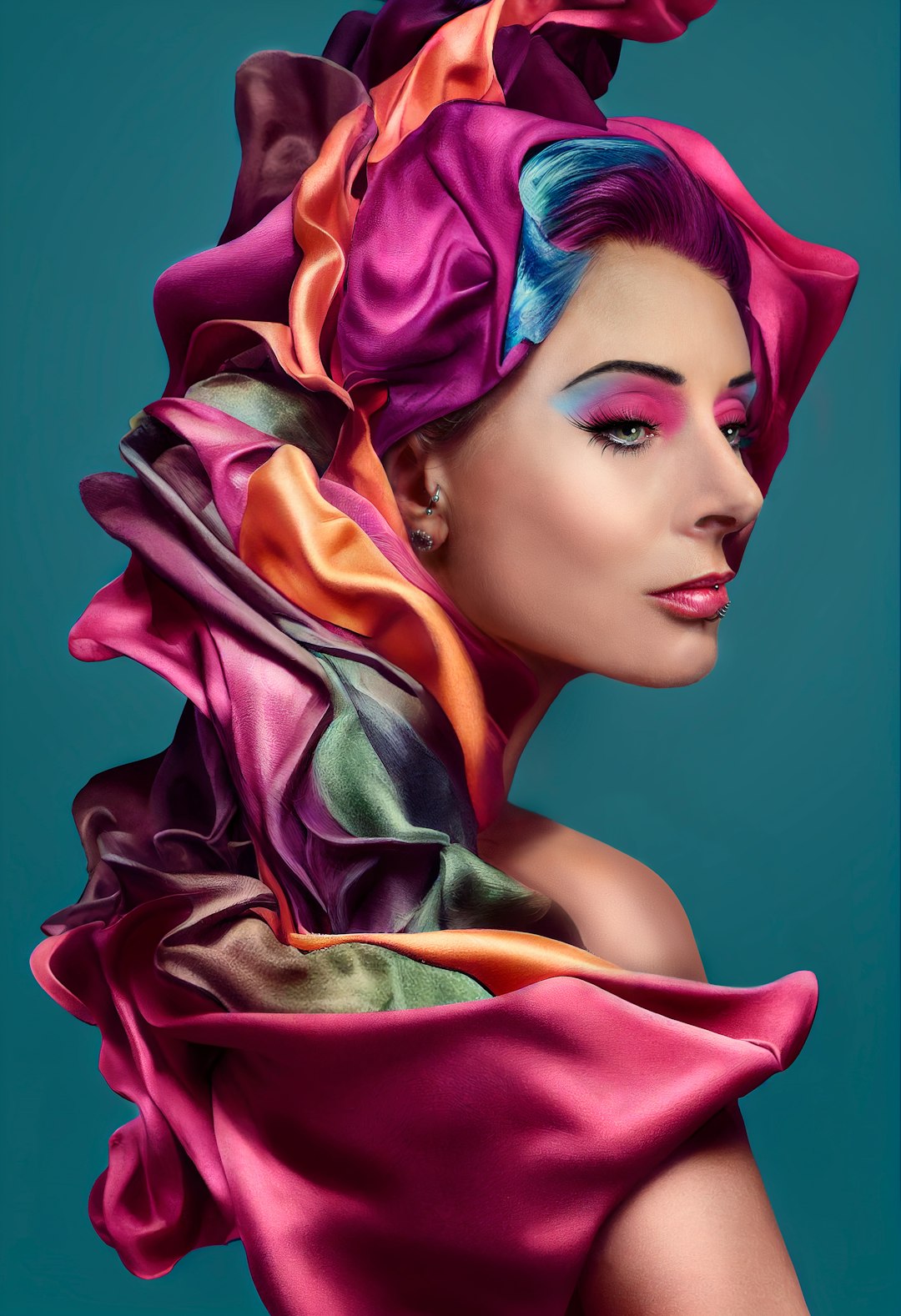
Quick Answer
Select your photo in Canva, click Edit photo (or Edit image) in the toolbar, then open the Filters panel and scroll to the very end, Duotone sits after the regular filter presets. Pick one of the named color presets, or tap the Highlights and Shadows color swatches to enter your own hex codes, then use the Intensity slider (set it to 100 for the full effect) and apply.
Step-by-Step: Applying Duotone to a Photo
Start by uploading your photo into a Canva design, or opening an existing design that already has the image placed on the canvas. Click on the photo to select it, then choose Edit photo (sometimes labeled Edit image) from the toolbar that appears above it. This opens the photo editing side panel.
In the side panel, open the Filters tab, this is where Duotone lives now, not in a separate Effects section. Scroll all the way down past the standard filter thumbnails (Vivid, Dramatic, and so on) to find Duotone at the bottom of the list. Clicking Duotone reveals a row of named two-color presets. Click any preset thumbnail to preview it directly on your photo.
To customize the colors instead of using a preset, click on the applied duotone effect again to open the Highlights and Shadows color controls. Click the Highlights swatch, then use the plus icon in the color panel to enter a specific hex code, this is how you match a brand color exactly. Repeat the same process for the Shadows swatch to set the second color.
Use the Intensity slider to control how strongly the two colors take over the photo. At lower intensity, Canva blends your chosen colors with the photo’s original tones, which can look muddy. Push the slider closer to 100 if you want the clean, fully replaced two-color look most duotone designs go for. Once it looks right, click Apply (or simply click outside the panel) to lock in the effect.
Choosing Colors That Actually Work
Duotone works best with high contrast between the two colors, one noticeably darker for shadows and one noticeably lighter for highlights. Pairing a dark navy or black with a bright accent color (like your brand’s primary color) tends to read as more polished than two mid-tone colors that are close in value.
If you’re building on-brand graphics, pull your exact brand hex codes for the highlight and shadow colors so the effect matches your existing palette instead of introducing a random new color into your designs. This is especially useful for cover images, social templates, and blog headers that need to feel consistent across a batch of images.
Photos with clear light and dark areas, a portrait with defined shadows, or a landscape with a bright sky and dark foreground, tend to produce a cleaner duotone result than flat, evenly lit photos, since the effect relies on that existing tonal range to map the two colors onto. Duotone also works best on actual photos (JPG or PNG raster images) rather than illustrations or vector graphics, which don’t respond to it the same way.
Tips and Common Mistakes
Looking for Duotone under a separate Effects tab is the most common reason people can’t find it, Canva now keeps it inside the Filters panel, at the very bottom of the list, so scroll past the named filter presets first. Leaving Intensity below 100 is another common reason a duotone effect looks washed out or inconsistent, if you want the full stylized look, push it all the way up. Setting Highlights and Shadows to the same or very similar hex codes will just flatten the photo into a single color wash rather than a true two-tone effect, so keep meaningful contrast between the two. It’s also worth applying the same duotone preset or custom colors across a whole set of images, rather than picking new colors each time, so a gallery or social feed feels cohesive. Finally, duotone tends to obscure fine detail, so it works better on simpler, higher-contrast photos than on busy images with lots of small elements.
Explore more: more Canva and design tutorials.
Duotone effect in Canva FAQs
Is the Duotone effect free in Canva?
Yes, the Duotone effect itself is available on Canva’s free plan, though some individual color presets may be part of Canva Pro’s premium content. Custom Highlights and Shadows hex color controls work on free accounts as well.
Where exactly is Duotone located in Canva?
Select your photo, choose Edit photo from the toolbar, then open the Filters panel in the side menu and scroll all the way to the end of the filter list. Duotone sits after the standard filter presets rather than in a separate Effects section.
Can I use my own brand colors for the duotone effect?
Yes. After selecting the Duotone effect, click the Highlights or Shadows color swatch and enter a specific hex code so the effect matches your exact brand colors instead of using a preset.
Why does my duotone effect look faded or blended with the original photo?
This usually means the Intensity slider isn’t set high enough. At lower intensity, Canva blends your chosen colors with the photo’s original tones; raise the slider toward 100 for a fully replaced two-color look.
Make Your Digital Life Better
More practical tech how-tos, tool picks, and guides to upgrade your everyday digital life. More on GTWebs.
Want web tips in your inbox? Subscribe to the free newsletter.
Photo by Alexey Demidov on Unsplash.