

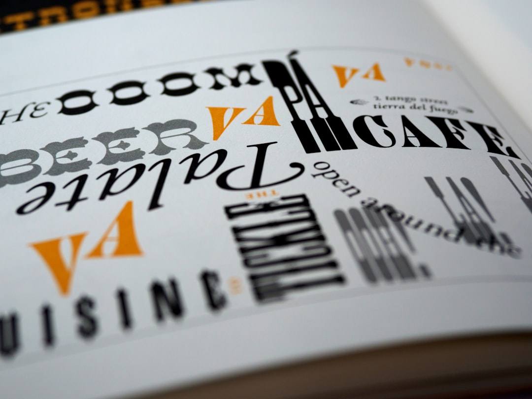
Picking two fonts that actually look good together is harder than it should be. Google Fonts alone hosts well over a thousand free typefaces, and most combinations you try will feel either boring or clashing.
Table of Contents
This guide gives you a quick answer, a repeatable method for judging any pairing, and a shortlist of combinations that consistently work well for website headings and body text as well as social media graphics.
Quick Answer
Pick one font with personality for headlines and one clean, highly legible font for body text or captions, and stop there. A serif-plus-sans-serif pairing (like Playfair Display with Inter) or a bold-plus-neutral pairing (like Space Grotesk with Inter) almost always works because the two fonts contrast enough to feel intentional instead of accidental.
How to Judge Any Font Pairing
Start with contrast, not similarity. Two fonts that look almost alike (say, two similar geometric sans-serifs) tend to look like a mistake rather than a design choice. Instead, pair fonts that differ in at least one clear way: serif versus sans-serif, bold display versus quiet workhorse, or wide versus condensed.
Limit yourself to two fonts per project, three at most if you add a distinct accent for things like buttons or labels. Every extra typeface adds visual noise and can slow down page load. Many popular Google Fonts families, including Inter and Work Sans, are variable fonts that pack their entire weight range into a single, continuously adjustable file, so pulling in several weights from the same family is cheap; families that are only offered as static fonts still load a separate file for each weight and style you use.
Test the pairing at real sizes before committing. A display font that looks striking at 60px can turn illegible in a small Instagram caption or mobile navigation menu, so preview both fonts at the actual sizes you’ll use, not just in a big mockup.
Match the mood to the brand. A didone serif like Playfair Display signals editorial or luxury; a rounded geometric sans like Poppins reads friendly and approachable; a monospace or grotesk like Space Grotesk feels technical or modern. Choose fonts whose personality matches what you’re selling before worrying about the finer details.
Reliable Pairings for Website Headings and Body Text
Playfair Display (headings) + Inter (body) — a high-contrast didone serif over a clean, screen-optimized sans-serif. Reads like an editorial, fashion, or premium brand site.
Space Grotesk (headings) + Inter (body) — a distinctive geometric display font paired with one of the most legible free sans-serifs available, a dependable combo for SaaS, startup, and portfolio sites.
Montserrat (headings) + Lato (body) — a bold geometric heading font over a calm, rounded body font; a classic, safe choice for business and agency sites.
Poppins (headings) + Work Sans (body) — Poppins’ rounded geometry feels warm and approachable in headlines, while Work Sans stays quiet and readable in paragraphs, which suits lifestyle and DTC brands.
Lora (headings) + Montserrat (body, or vice versa) — a contemporary serif with just enough character paired with a clean sans-serif, good for a trustworthy, established feel.
Pairings for Social Media Graphics
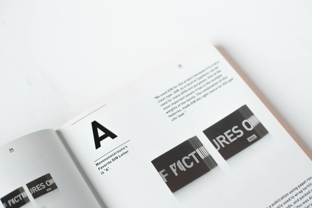
Social graphics get scrolled past fast, so headline fonts need to be bold enough to stop the thumb and body fonts need to stay readable at small sizes. Bebas Neue (headline) + Montserrat (supporting text) is a go-to for bold announcement-style posts, since Bebas Neue’s tall condensed caps punch through a crowded feed.
Anton (headline) + Work Sans (supporting text) gives a similar high-impact look with slightly heavier weight, well suited to Stories and quote graphics.
DM Serif Display (headline) + Poppins (supporting text) leans more editorial and works well for lifestyle, beauty, or hospitality content.
Raleway (headline) + Open Sans (supporting text) is a softer, more versatile option when you want something clean rather than shouty.
Tips and Common Mistakes
Don’t use more than two font families on a single graphic or page — swap in weights (light, regular, bold) from the same family instead of reaching for a third typeface. Avoid pairing two fonts that are stylistically too close, since near-matches read as inconsistency rather than harmony.
Check that the body font you choose supports the weights and any special characters you need (accents, numerals) before locking it in — not every Google Fonts family ships with a full weight range or a variable-font version. Finally, only load the weight range you actually use: a variable font lets you request just the slice of its weight axis you need (for example 400 to 700) instead of the full range, while for a family that’s only offered as static files, each additional weight is another file to fetch.
Explore more: professional web design services.
Google Font pairings FAQs
How many fonts should I use on a website?
Two is the sweet spot — one for headings, one for body text. A third accent font is fine for small elements like buttons or badges, but adding more than that usually hurts consistency and page speed.
Can I pair two sans-serif fonts together?
Yes, as long as they contrast in weight, width, or style — for example a geometric display sans like Space Grotesk with a neutral workhorse like Inter. Avoid pairing two sans-serifs that look nearly identical.
What’s the most legible Google Font for body text?
Inter is one of the most widely used options for body copy because it was designed specifically for screen readability at small sizes, but Work Sans, Open Sans, and Lato are also solid, widely supported choices.
Are Google Fonts free to use commercially?
Yes, every font hosted on Google Fonts is free and open-source, and can be used on commercial websites, in social media graphics, and in printed materials without licensing fees.
Make Your Digital Life Better
More practical tech how-tos, tool picks, and guides to upgrade your everyday digital life. More on GTWebs.
Want web tips in your inbox? Subscribe to the free newsletter.
Photo by Brett Jordan on Unsplash.